
Knowledge and advice
WCAG accessibility for public touchscreens and kiosks
What does WCAG 2.1 mean for your touchscreens and information totems? Read which requirements apply, for whom they are mandatory and how to set up an accessible display.
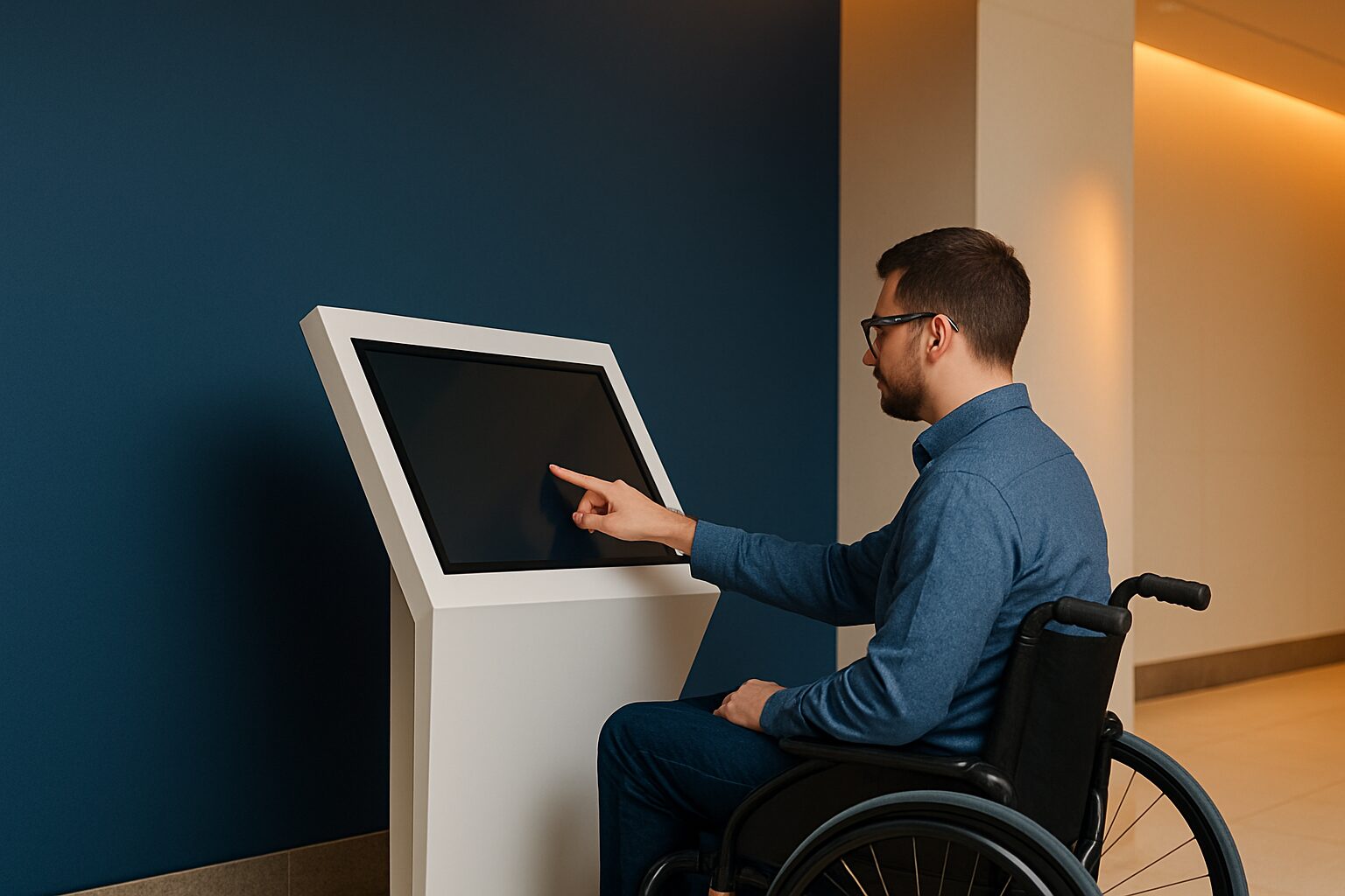
WCAG accessibility for public touchscreens and kiosks
WCAG 2.1 (Web Content Accessibility Guidelines) is the international standard for digital accessibility, laid down in the European standard EN 301 549. Level AA is legally required in the Netherlands for government organisations and public law institutions. For public touchscreens and information pillars this means: sufficient colour contrast, readable typography, operable interface elements and understandable navigation — regardless of whether a user has a visual, motor or cognitive impairment.
Who is WCAG mandatory for on public displays?
The obligation applies broadly. Public authorities must make their websites and mobile applications accessible by applying standard EN 301 549, which includes the requirements of WCAG 2.1 AA. This applies to municipalities, ministries, provinces, water boards, educational institutions and healthcare institutions with a public task.
For commercial parties, the situation changed as of 28 June 2025. Since that date, obligations also apply to commercial parties via the European Accessibility Act (EAA). Companies with more than 10 employees or an annual turnover above 2 million euros fall under this law. A touchscreen kiosk in a public space — a town hall, hospital, university or large office — will therefore quickly fall under the rules.
Important distinction: the law primarily focuses on websites and apps. EN 301 549 also describes requirements for non-web software, including kiosks running custom software. Anyone using an information pillar as a public counter would do well to apply the same WCAG principles to the interface.
The four WCAG principles translated to displays
WCAG is built around four core principles: Perceivable, Operable, Understandable and Robust. For a public touchscreen or kiosk, this works as follows:
Perceptible
- Colour contrast between text and background: at least 4,5:1 for normal text, at least 3,0:1 for large text (bold ≥14pt or normal ≥18pt).
- Never use colour as the only way of conveying information — always combine it with an icon or text.
- Provide subtitles for videos with spoken information.
Operable
- Buttons and tap targets at least 44×44 pixels in size.
- No functions that work only via complex gestures (swipes, multiple fingers).
- Make interaction time limits adjustable or disable them.
Clear
- Clear, short instruction texts without jargon.
- Consistent navigation order on every page of the interface.
- Error messages that clearly describe what is wrong and how the user can fix it.
Robust
- The interface works correctly with assistive technologies such as screen readers or external input devices.
- Use structured, semantically correct formatting in the software.
Concrete example: information kiosk in a town hall
A municipality places an information pillar in the public hall. Visitors can book an appointment, collect a form or find their way around the building. The municipality falls under the Digital Government Act and must comply with WCAG 2.1 level AA — a total of 50 success criteria.
In practice, this means for the kiosk interface:
- White text on a dark blue background achieves a contrast ratio of well over 8:1 — well above the standard of 4,5:1.
- All buttons are at least 44×44 pixels and have a visible focus outline.
- The home page offers a clear choice of up to five options, without distractions.
- A 'back' button is present on every page and in the same position.
The PixioKiosk (information kiosk with touchscreen) is available in 21,5″, 32″, 43″ and 49″. The 43″ variant costs current price on request (price list Q2 2026) and can also be leased for current price on request per month — lowering the threshold for investing in a future-proof, accessible display. The larger screen area of the 43″ or 49″ makes it easier to show text at a sufficient size without crowding the interface.
What changes with the EAA for B2B organisations?
Before 28 June 2025, the digital accessibility requirement applied only to government bodies. With the entry into force of the EAA, obligations also apply to commercial parties. Think of organisations in transport, financial services, e-commerce and telecoms.
For Mark — responsible for office space at a medium-sized or large company — this means in practical terms: a touchscreen reception desk, a self-service kiosk in the canteen or an interactive information display in the lobby may potentially fall under the EAA if the public has access to the interface. Companies with fewer than 10 employees or annual turnover below €2 million are exempt — for most B2B environments, that exception does not apply.
The advice: start with WCAG AA as your design principle, even if you are not formally required to (yet). Accessible design increases ease of use for everyone — including visitors with a temporary impairment, older people or people who are less proficient in the language.
Practical checklist for accessible display interfaces
| Requirement | WCAG criterion | Minimum value |
|---|---|---|
| Text colour contrast | 1.4.3 (AA) | 4,5:1 (normal), 3,0:1 (large) |
| Colour contrast icons/buttons | 1.4.11 (AA) | 3,0:1 |
| Minimum tap size | 2.5.5 (AA) | 44×44 px |
| Adjustable time limit | 2.2.1 (A) | Yes, or no limit |
| Error messages described | 3.3.1 (A) | Text, not just colour |
| Consistent navigation | 3.2.3 (AA) | Same order on every page |
| Video subtitles | 1.2.2 (A) | Mandatory for spoken content |
This checklist is a starting point, not a full audit. For public authorities, a formal accessibility assessment is mandatory, based on the WCAG-EM method.
Accessibility and hardware: what you can expect from the display itself
WCAG is about the software interface, but the hardware also plays a role. When placing a kiosk, take account of:
- Height: a screen at 120–140 cm eye level is usable for wheelchair users and standing visitors alike.
- Brightness: in lit public spaces, 400 cd/m² is sufficient; with direct daylight, you need more. The PixioDisplay Luxe (49″ touchscreen, 67×185 cm) costs current price on request (lease current price on request p.m., price list Q2 2026) and is designed for continuous use in public environments.
- Housing: an integrated Android computer (Android 13/14) makes separate media players unnecessary and simplifies the management of the accessible interface.
- Sound: a built-in speaker enables audio support for users who prefer to hear the interface rather than read it.
For more design principles that improve the user experience on touchscreens, read the article 10 design rules for public touchscreens.
Conclusion: start with design, not compliance
WCAG accessibility is not an endpoint you reach and then forget. It is a design principle you apply from the start. Choose sufficient contrast, large tap targets and clear language — then you comply with the law and make the interface better for every user. Public-sector organisations are already required to do so; B2B organisations above the legal threshold will follow via the EAA.
View the digital information column as a starting point for an accessible public display, or ask for the price list for an overview of models and lease options.
Frequently asked questions
Is WCAG mandatory for a touchscreen kiosk in a town hall?
Yes. Municipalities fall under the Digital Government Act, which makes WCAG 2.1 level AA mandatory for all digital services. An information totem that functions as a public counter falls under this obligation. The European standard EN 301 549 also describes requirements for kiosks with adapted software.
What colour contrast is required at minimum for text on a display?
WCAG 2.1 level AA requires a contrast ratio of at least 4,5:1 for normal text. For large text (bold ≥14pt or regular ≥18pt), a minimum of 3,0:1 applies. Icons and buttons must have a contrast of at least 3,0:1 against the background.
Does the EAA also apply to a touchscreen in a private office?
The EAA applies to organisations that offer digital services to consumers and have more than 10 employees or an annual turnover above €2 million. A display used only internally by employees falls outside the scope. As soon as visitors or customers use the interface, it becomes more relevant to apply WCAG principles.
How large should buttons be on a touchscreen for WCAG compliance?
WCAG 2.5.5 (level AA) specifies a minimum target size of 44×44 pixels. On a touchscreen without a mouse, this is especially important: buttons that are too small cause errors for people with motor impairments or tremors. Larger screens (43″ or 49″) make it easier to design generous tap targets.
Do I have to publish an accessibility statement for a kiosk?
Public bodies are required to publish an accessibility statement for every website and app. For a kiosk interface, this formally applies if the software is classified as an app or web application. Consult the completion assistant on toegankelijkheidsverklaring.nl and have the interface audited at least every three years.