
Knowledge and advice
10 design rules for public touchscreens that really work
Designing a public touchscreen? Follow these 10 concrete UX rules for touch targets, contrast, accessibility and session management — and avoid the most common mistakes.
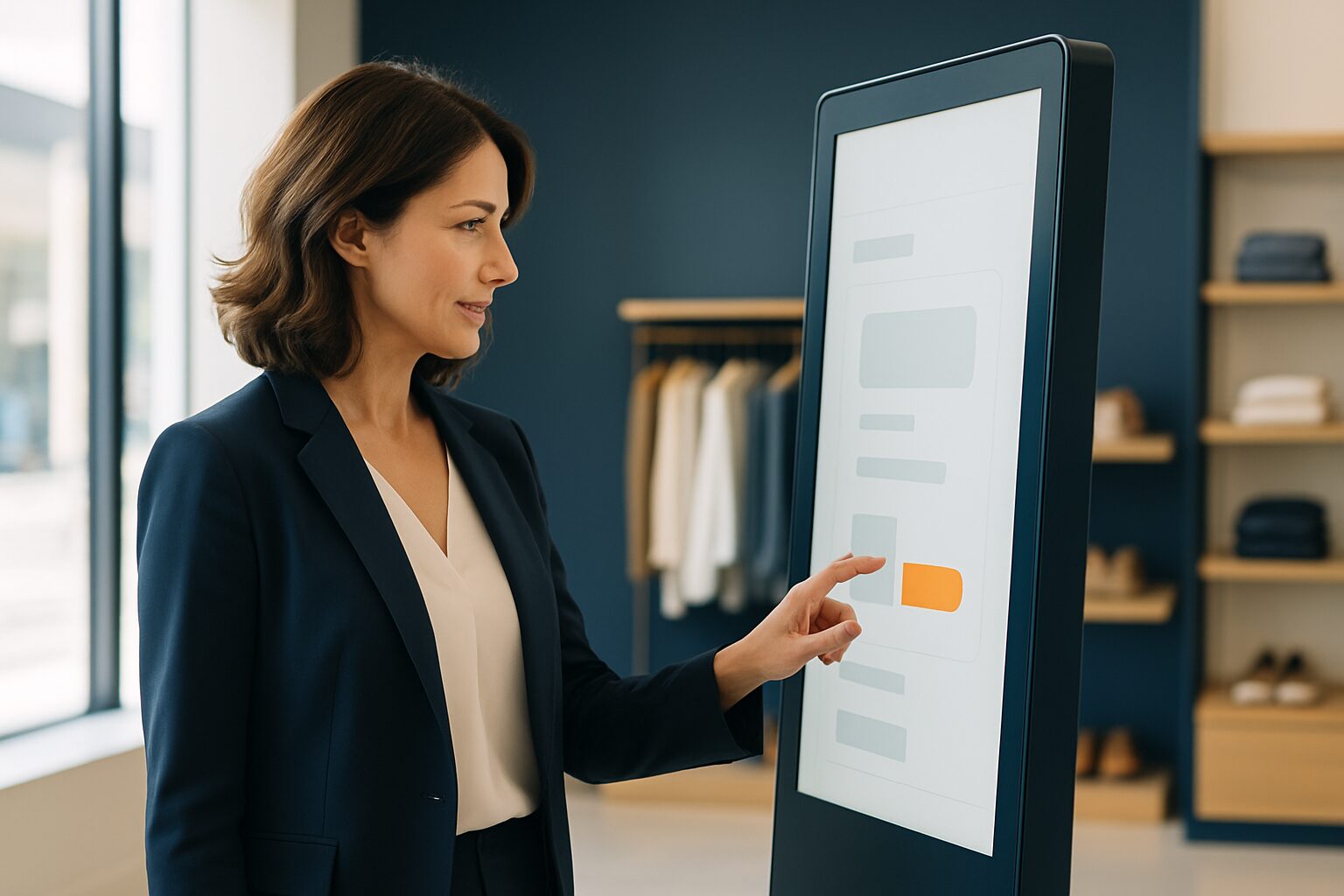
A public touchscreen is a self-service terminal that, without instruction, must be operable correctly by any visitor on the first attempt. That places different demands on design than a website or app: the user is standing, may have wet hands or gloves on, does not know the interface, and has no patience for mistakes. The following ten rules give you a concrete framework — from touch target to session management.
1. Target audiences: bigger than you think
A finger is not a mouse cursor. Research from the MIT Touch Lab shows that the average fingertip 1,6 to 2 cm wide is, and a thumb averages 2,5 cm. Buttons must therefore have at least 1 × 1 cm of physical surface area — on a 21" screen with 1080p resolution, that comes to around 82 pixels. Keep at least 5 mm of free space between clickable elements so that a miss does not immediately trigger the wrong action.
If you choose a larger digital information column, then the margins scale along with it. On a PixioKiosk of 43" (current price on request buy, price list Q2 2026) buttons of 120–150 pixels wide are a safe starting point at Full HD.
2. Design for mobile, not desktop
Kiosk interfaces are too often built like a reduced website. That is a mistake: the interaction on a touchscreen is identical to that on a smartphone — you see something, you touch it, something happens. Desktop conventions such as hover states, right-click menus and small scroll bars do not work on glass. Use mobile design patterns as the basis: large buttons, clear hierarchy, minimal input.
A concrete consequence: avoid text fields where possible. Let visitors choose from options instead of typing. Every keyboard interaction increases the chance of drop-off.
3. Maximum three clicks to the goal
Public screens are used by people with a clear purpose and little time. Limit the navigation depth to a maximum of three steps. Each extra layer increases the chance that a visitor will drop out or take the wrong route. Make the main tasks immediately visible on the home screen — not hidden behind a hamburger menu.
Test this with the 'stranger test': give someone who does not know the interface a task and measure how long it takes them. More than 30 seconds for a simple action is too long.
4. Font size and contrast for standing users
A visitor stands 50–80 cm from the screen, not 30 cm as behind a laptop. Text must be at least 4 mm high on the screen — on a 21″ 1080p display that is around 20–24 px. For headings, use at least 32 px. Choose a clean sans-serif typeface; decorative fonts reduce readability under time pressure.
Contrast is not an aesthetic choice. WCAG 2.1 level AA requires a contrast ratio of at least 4,5:1 for normal text and 3:1 for large text. That also applies to public touchscreens — especially now that the European Accessibility Act (EAA) enters into force on 28 June 2025 and also require commercial organisations to make digital services accessible.
5. Accessibility is no longer optional
The EAA explicitly mentions interactive self-service terminals such as information and ticket kiosks as products to which accessibility requirements apply. In practical terms, this means:
- Sufficient colour contrast (WCAG 2.1 AA)
- Support for alternative operation (physical buttons or audio output)
- Clear error messages in plain language
- No time limit that cannot be extended
For physical self-service terminals put into use before 28 June 2025, a transition period of up to 20 years applies, or until the end of their economic life. However, software updates must comply with accessibility requirements as quickly as possible.
In the Netherlands there live around 2 million people with a disability. An accessible touchscreen increases your reach immediately.
6. Provide direct visual feedback
A touchscreen makes no click sound and no tactile feedback. Without a visible response, the user does not know whether their touch has been registered — and taps again, sometimes several times. Always show an immediate visual response: colour change, animation or loading indicator within 100 milliseconds after touch.
The same applies to loading times. If an action takes longer than 1 second, show a progress indicator. If it takes longer than 3 seconds, explain why. Stillness without feedback is always interpreted by users as a fault.
7. Session management: reset after use
A public terminal is used by hundreds of people per day. Without an automatic reset, personal information or a half-completed form remains visible to the next visitor. That is a privacy risk and a UX problem.
Set an inactivity timer of 30–60 seconds. Give the user a warning ("Your session will be reset in 10 seconds") with the option to extend it. After the reset, return to the home screen — not to an empty page. For the privacy-law aspect, refer to the article Public displays and privacy law: what is and is not allowed.
8. Design for the environment, not just the screen
A touchscreen in a busy shopping street has different requirements from one in a quiet reception hall. Take account of:
- Ambient light: in direct sunlight, a brightness of at least 1.000 nits is required for readability; outdoors 3.500 cd/m².
- Sound: in noisy environments audio feedback does not work; use visual alternatives.
- Height: mount the active touch area between 90 and 130 cm from the floor, so that wheelchair users can also reach the screen.
- Queue: plan enough space around the totem for a queue without blocking the passageway.
The PixioDisplay Luxe (49", 67×185 cm) with a purchase price of current price on request (price list Q2 2026) is an example of a format that serves both standing and seated users without additional adjustments to the setup.
9. Error handling: be specific and friendly
Error messages on public screens are read by people who are already frustrated. Avoid technical jargon ("Error 404", "Connection lost") and instead write what the user should do: "This is not working right now. Please try again or ask a member of staff for help."
If there are input errors, show immediately what is wrong and how it can be improved. Highlight the problematic field visually. Leave the already entered data in place — the user should not have to start again.
10. Test with real users in the real environment
The most common mistake in touchscreen design is testing behind a desk. An interface that feels smooth on a laptop can fail completely on a standing screen with backlighting and a busy background. Always test on site, with representative users — including older people and people with disabilities.
Iterate after going live. Analyse where users drop out, which buttons are missed most often, and how long sessions last on average. Kiosk UX is not a one-off project; it is an ongoing process.
These ten rules form the basis for a touchscreen interface that visitors understand immediately and can use without help. For the broader context of conversion optimisation and UX in a retail environment, read on in Touchscreen displays in retail: conversion optimisation and UX. Do you want to know which screen size and setup suit your location? See the PixioKiosk product page or request the current price list on.
Frequently asked questions
How large must buttons be on a public touchscreen at minimum?
Research by the MIT Touch Lab shows that an average fingertip is 1,6–2 cm wide. UX guidelines recommend a minimum touch target of 1 × 1 cm of physical surface, with at least 5 mm space between clickable elements. On a 21″ 1080p screen, that is roughly 82 pixels per button.
Does a public touchscreen have to comply with WCAG or the European Accessibility Act?
Yes. The European Accessibility Act (EAA), which comes into force on 28 June 2025, explicitly names interactive self-service terminals as a product to which accessibility requirements apply. The requirements apply immediately to new terminals; existing hardware has a transition period of up to 20 years, but software updates must comply with the requirements as soon as possible.
How long may a session inactivity period be on a public kiosk?
An inactivity timer of 30–60 seconds is common. Always give the user a warning with the option to extend the session. After the reset, you return to the start screen — not to a blank or error page.
What screen height is accessible for wheelchair users?
Mount the active touch area between 90 and 130 cm from the floor. This allows both standing and seated users, including wheelchair users, to operate the screen independently. This also aligns with the EAA functional requirements for public terminals.
What is the difference between a retail touchscreen and one for a public space?
In retail, you know your target audience reasonably well and can tailor the interface to returning users. In a public space, people use the interface for the first time, without instruction, often under time pressure. That calls for an even simpler navigation structure (maximum three clicks), larger touch targets and mandatory session resets after use.