
Knowledge and advice
Designing touchscreen kiosks for diverse audiences: UX guide
Design a touchscreen kiosk that works for everyone: from trade fair visitor to senior. Practical UX guidelines, accessibility standards and hardware advice.
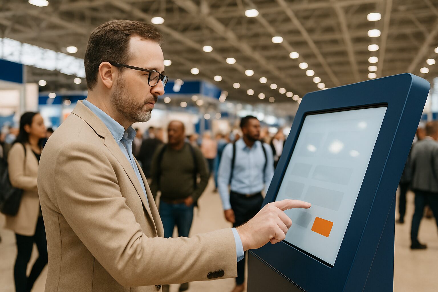
A touchscreen kiosk is a freestanding, interactive screen in a public space where visitors can independently request information, select products or register themselves. A successful design achieves three goals at once: it works intuitively for the first user who sees the screen, it is accessible for people with disabilities, and it processes each interaction in fewer than three taps — regardless of the user’s age, language skills or digital experience.
In short
- Always design for the most vulnerable user in your audience: if it works for older people or people with disabilities, it works for everyone.
- Reach height, font size, contrast ratio and time limits are the four parameters that have the greatest impact on inclusivity.
- Trade fairs and events require a different design than retail or museums: high footfall calls for shorter flows and larger buttons.
- WCAG 2.2 AA is the minimum standard for digital accessibility in the Netherlands and Belgium; for public kiosks, physical standards also apply (NEN-EN 17210).
- Start with audience analysis before you choose a screen size — the hardware follows the design, not the other way round.
Why audience analysis before hardware
Many organisations choose a screen first and then design the interface. That produces kiosks that work technically but fail in practice. Start with three questions: who is standing in front of the screen, what does that person want to achieve, and how much time do they have?
A trade fair visitor at the Jaarbeurs Utrecht — which annually about 2,5 million visitors The person receiving — has on average 8 to 12 seconds of patience at a kiosk. A museum visitor takes 60 to 90 seconds. Those time differences determine the depth of your navigation structure, the amount of text per screen and the size of your buttons.
Three user profiles are relevant for most public kiosks in the Netherlands:
| Profile | Typical context | Critical UX factor |
|---|---|---|
| Busy trade fair visitor | Trade fair, event | Speed: max. 3 steps to goal |
| Senior (65+) | Government, retail, healthcare | Font size ≥ 20 pt, large touch surfaces |
| User with disability | All public spaces | WCAG AA contrast, reach height 75–120 cm |
The four UX parameters that matter most
Touch height. The European standard NEN-EN 17210:2021 for accessibility of the built environment stipulates that operating elements must be reachable for wheelchair users. In practice, this means: place interactive zones between 75 and 120 cm high. Buttons above 130 cm are out of reach for many users.
Font size and contrast. WCAG 2.2 AA requires a contrast ratio of at least 4,5:1 for normal text and 3:1 for large text (≥ 18 pt normal or ≥ 14 pt bold). On a touchscreen viewed from a distance — especially outdoors or in a busy exhibition hall — 24 pt is a safer minimum.
Touch surface. Apple and Google use 44×44 pt as the minimum touch target for mobile interfaces. For a public kiosk, where users are standing and sometimes tapping with gloves on or a bag in hand, 60×60 px is a more realistic lower limit.
Time limits. Sessions with an automatic timeout of less than 30 seconds frustrate slower users. Set timeouts to at least 60 seconds and give a visible warning with the option to extend — this is also a WCAG requirement (success criterion 2.2.1).
Three concrete examples: trade fair, retail and museum
Example 1 — Trade fair (B2B context). At a trade fair in the RAI Amsterdam or Jaarbeurs Utrecht, the kiosk serves as a lead generator or product configurator. The flow has a maximum of three steps: choose → see result → leave details. Use large, labelled buttons (minimum 80×80 px), no scrollable lists and a direct back button on every page. Slow animations to a maximum of 0,3 seconds — faster feedback feels responsive, slower feedback feels broken.
Example 2 — Retail. In a retail environment, the visitor wants to find a product or place an order quickly. Children also use the system here. Keep navigation hierarchical: no more than two levels deep. Avoid drop-down menus — they work poorly on touch. Use icons with text labels, not icons alone. The PixioDisplay Luxe with 49″ touchscreen and a size of 67×185 cm offers sufficient screen space to show large buttons and product images side by side without compromising readability.
Example 3 — Museum or cultural institution. Visitors expect depth here. Multiple language layers make sense: a short summary at the top, with the option to read on. Use audiovisual support for people with limited literacy and children. You can read more about this specific context in Interactive kiosk for museums and cultural institutions: what works and what do you need to arrange.
Accessibility: from WCAG to physical standards
WCAG 2.2 AA is the standard used by Stichting Accessibility to assess Dutch UX designs. The four principles — perceivable, operable, understandable and robust — also apply to kiosk interfaces. In practical terms, this means:
- Colour contrast ≥ 4,5:1 for body text
- Do not communicate information exclusively through colour
- Error messages describe what is going wrong, not just that something is going wrong
- Buttons have a descriptive label, not just an icon
In addition to the digital layer, physical accessibility requirements apply. NEN 9120, published on 3 February 2025, describes performance requirements for accessibility and usability of buildings and is the Dutch implementation of universal design. Kiosks in public buildings fall within the scope of this standard. That has consequences for placement (clear passage around the column), screen angle and the presence of physical emergency buttons.
For a step-by-step approach to making your kiosk fully WCAG-compliant, see Making a touchscreen kiosk WCAG-accessible: step by step.
Choosing screen size and hardware based on context
The screen size follows the use case, not the budget preference. A screen that is too small forces small buttons and dense text; a screen that is too large at the wrong height is unusable for shorter users or wheelchair users.
| Context | Recommended size | Reason |
|---|---|---|
| Reception / welcome | 21,5″ – 32″ | Short distance, standing use |
| Retail / self-service | 32″ – 43″ | Product images require space |
| Trade fair / event | 43″ – 49″ | Visibility from a distance, large buttons |
| Museum / floor | 43″ – 55″ | Multiple content levels side by side |
The PixioKiosk is available in 21,5″, 32″, 43″ and 49″ — four sizes, each serving a different use. The integrated Android computer makes it possible to load content via USB, a website URL or the PixioApp, without an external media player.
For temporary use at a trade fair or event, renting is a logical choice. View the options at /tv-scherm-huren-beurs/ or the general rental page.
Content design: less is more, structure is everything
The biggest mistake with kiosk content is copying a website onto a screen. A kiosk is not a website. Users are standing, have no mouse and are often distracted by their surroundings.
Seven rules for kiosk content:
- One goal per screen. No two actions on the same page.
- Primary action always bottom right or centred at the bottom. That is the natural engagement zone for standing users.
- Maximum 40 words per screen. No further text is read.
- Icons always with a text label. Icons are not universally recognisable.
- Feedback within 0,3 seconds. Waiting longer leads to repeated tapping and errors.
- Back button on every page, top left. Users who make a mistake should always have a way out.
- Start screen after 60 seconds of inactivity. That way the kiosk is always ready for the next user.
Testing with real users
A design that works in Figma does not automatically work on a standing touchscreen in a busy space. Always test with at least five users from your target group — including someone aged 65+ and someone seeing the interface for the first time.
Pay particular attention to: where do people tap first, which buttons are missed, and at what point do people drop out? Those three observations provide more useful data than a follow-up survey.
You can read more about test methods and tools in Testing a touchscreen kiosk for usability: methods and tools.
Trade fair kiosks: specific considerations
At trade fair participations — such as at the Facility Trade Fair or Infosecurity in the Jaarbeurs Utrecht, which organises more than 1.000 events each year — additional requirements apply:
- Sound. Trade fair halls are loud. Use large, clear visual feedback instead of audio feedback. If you do use audio, use a headphone socket or directed speaker.
- Light. Trade fair lighting varies greatly. Choose a screen with at least 400 cd/m² for indoor use — the PixioDisplay Mobile with 43″ touchscreen and 400 cd/m² brightness is a suitable choice here for temporary use.
- Throughput speed. Design for peak load: several visitors in a row, without the kiosk needing to be restarted.
- Hygiene. At trade fairs, hundreds of people touch the screen every day. Use toughened glass and an interface without small corners where dirt collects. Read more about cleaning in Cleaning and disinfecting a touchscreen: hygiene in retail and hospitality.
ALDI Netherlands used a PixioDisplay video wall during a staff event to inform large groups of employees at the same time. The choice for a large display surface with clear content — without visitors needing to tap anything — illustrates a deliberate UX choice: at high footfall and with large groups, passive display is sometimes more effective than interaction.
Conclusion: start with the user, end with the hardware
A touchscreen kiosk that works for diverse target groups is no accident. It is the result of three choices in the right order: first audience analysis, then content structure, then hardware. Anyone who reverses that order builds an expensive screen with an interface nobody understands.
Choose a screen size that suits your context and user profile. Comply with WCAG 2.2 AA for the digital layer and NEN-EN 17210 for the physical placement. Test with real users before launch. And always design for the most vulnerable user in your audience — if it works for that person, it works for everyone.
View the PixioKiosk product page for specifications by size, or plan a showroom visit in Montfoort to experience the hardware in practice.
Frequently asked questions
How large should buttons be on a public touchscreen kiosk?
For a public kiosk, 60×60 px is a safe minimum for touch targets. Users are standing, sometimes distracted and tap with one finger — sometimes with gloves. Smaller buttons lead to errors and frustration. For older users or people with motor impairments, 80×80 px is a better lower limit.
Which accessibility standard applies to a touchscreen kiosk in the Netherlands?
For the digital interface, WCAG 2.2 AA applies as the minimum standard — this is also the standard used by the European Accessibility Directive. For the physical placement of the kiosk, NEN-EN 17210:2021 is relevant: that standard describes accessibility and usability of the built environment, including controls at the correct reach height (75–120 cm).
At what height should I place a touchscreen kiosk?
Interactive zones — buttons and input fields — should be between 75 and 120 cm in height. That range is accessible for standing adults and wheelchair users alike. Informational content may be placed higher, but primary actions should never be above 130 cm.
How many steps may a kiosk flow have at most?
In a busy environment such as a trade fair or shop, the rule is: a maximum of three steps from home screen to goal. More steps greatly increase the chance of drop-off. In a museum context, the flow may be deeper, provided each step offers optional further information and the user can always go back.
What screen size is best for a trade fair stand?
For a trade fair stand, 43″ or 49″ is the most commonly used choice. That size is visible from a distance, offers space for large buttons and product images side by side, and fits most stand setups. The PixioKiosk is available in 21,5″, 32″, 43″ and 49″, so you can match the size to the stand dimensions.
Do I need to design a kiosk differently for seniors?
Yes. Use a minimum font size of 20 pt for body text, large touch targets (80×80 px or more), high contrast (4,5:1 or higher) and generous time-outs of at least 60 seconds. Avoid distracting animations and make sure error messages clearly describe what the user must do.
How do I stop a kiosk interface from becoming too complicated?
Follow the rule: one purpose per screen, a maximum of 40 words per page and no two primary actions side by side. Test the design with someone who has never seen the interface before — if that person cannot reach the goal in three taps, the flow is too complex.
Can I use the same kiosk interface for trade fairs and retail?
Technically yes, but not in terms of content. The flow for a trade fair (lead generation, product configuration) differs fundamentally from retail (finding products, checkout). Use the same hardware and the same design system, but adapt the navigation structure, time limits and content depth to each context.
How do I test a kiosk for user-friendliness for different target groups?
Test with at least five users per target group, including someone aged 65+ and someone seeing the interface for the first time. Observe where they tap first, which buttons they miss and at what point they drop off. Additional methods and tools can be found in the knowledge base article on testing touchscreen kiosks for usability.
What is the minimum brightness for an indoor touchscreen kiosk?
For an indoor setting, 400 cd/m² is sufficient. That is enough for office, retail and trade fair environments with normal lighting. In direct sunlight — for example in a shop window or an outdoor setup — you need at least 1.500 to 3.500 nits, depending on exposure.